How I Pair Lettering Fonts Together
I remember asking the teacher in my first lettering class how to determine which lettering styles would look good paired together. I had found plenty of “font pairing basics” on Pinterest that mixed a serif with a sans serif font, a cursive font with a print font, or used a bold font with a skinny font, but none of them seemed to translate to hand lettering. I can’t remember her exact answer, but it was something along the lines of just practicing and trying different options until finding a design you liked. And while that is true, I have found that there are two foolproof tricks I always come back to when creating designs: 1) keep a common element between the two fonts and 2) a basic font will look great paired with a more elaborate font. Let me explain…
Keep a common element
Between multiple fonts, drawn elements, and different colors, I want my designs to stay readable and not get too busy. To help balance out a more busy design, I will make sure that the two fonts in my design have at least something in common. That might be that I’m adding serifs to everything, keeping the crossbar height consistent, writing in all capitals, or having solid filled in downstrokes. Here are some examples:

Common element: the downstrokes are hollow. For a larger example of these styles together, check out this free download.

Common elements: serifs and high crossbars. For more examples of how changing crossbar height can alter your lettering, check out this post.

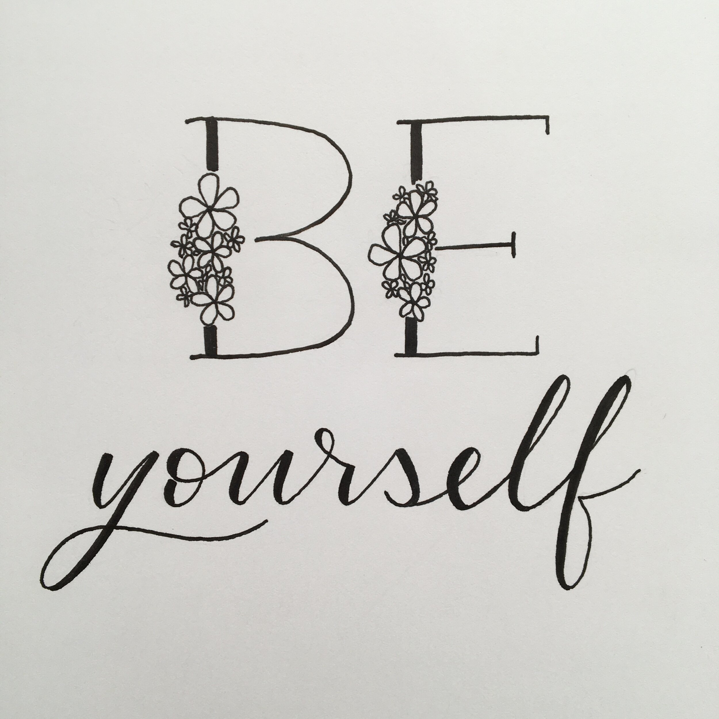
Common elements: no serifs and both have a simple vertical line in the decoration. The added detail in the top word adds interest while still staying similar.
A Basic font + A more Elaborate font
A basic font (whether print or cursive) with simple thick downstrokes compliments literally any. other. font. Pairing two really complicated fonts can make it hard to know what to concentrate on. But picking one stand-out font to highlight certain words or phrases and then filling in the rest with a more plain font will keep your layouts looking balanced. Here are some examples:
A solid cursive calligraphy style is my go-to. See this font combination with a longer quote here.

An all-caps sans-serif font is also pretty safe. Even though there isn’t that much going on in the second line, it’s just enough that another fancy font might get too busy.

Sometimes, just decorating the first letter of a word can make a big impact. When I do this, I make sure there is still a common element with the rest of the word (in this case: serifs and capital letters).